Font

Cralic Coob

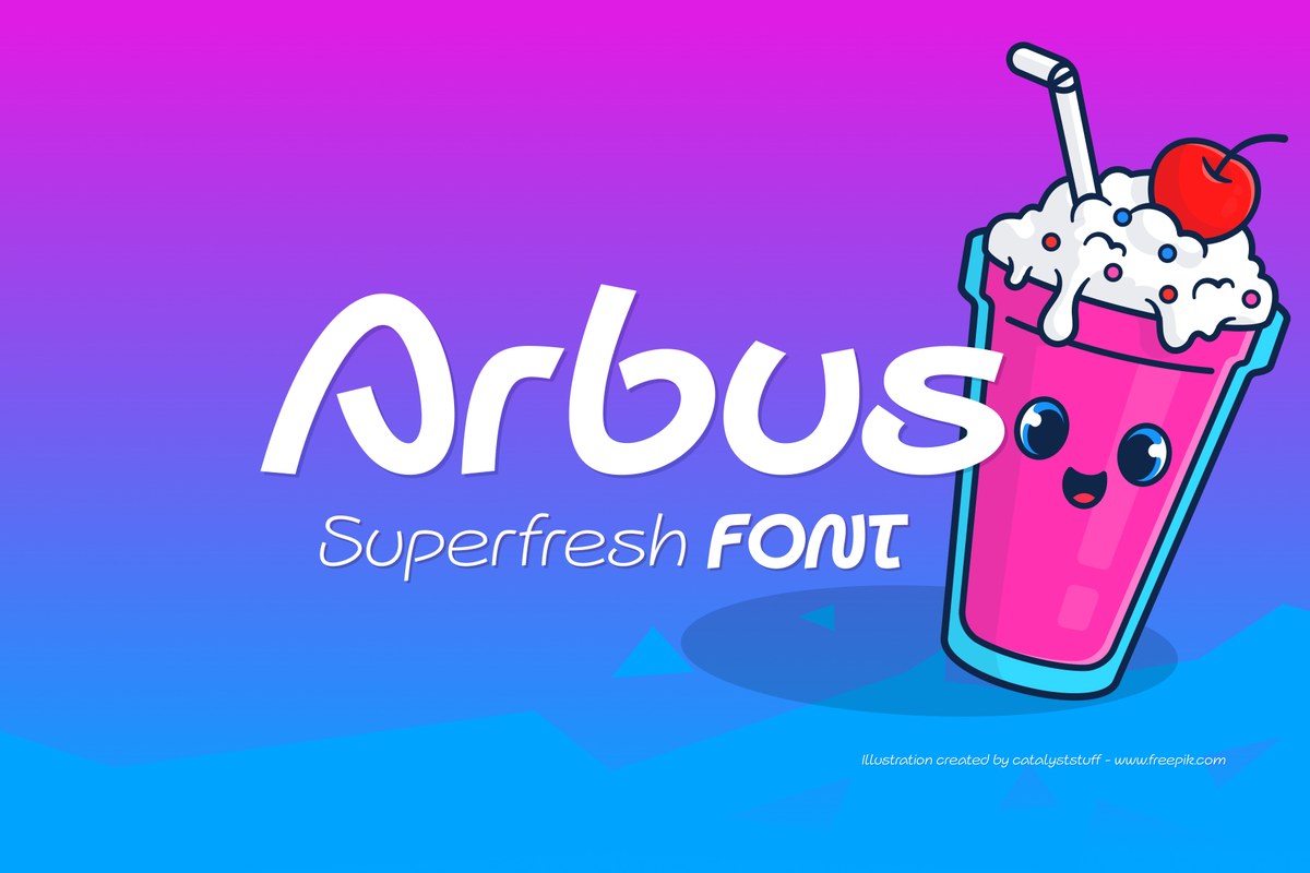
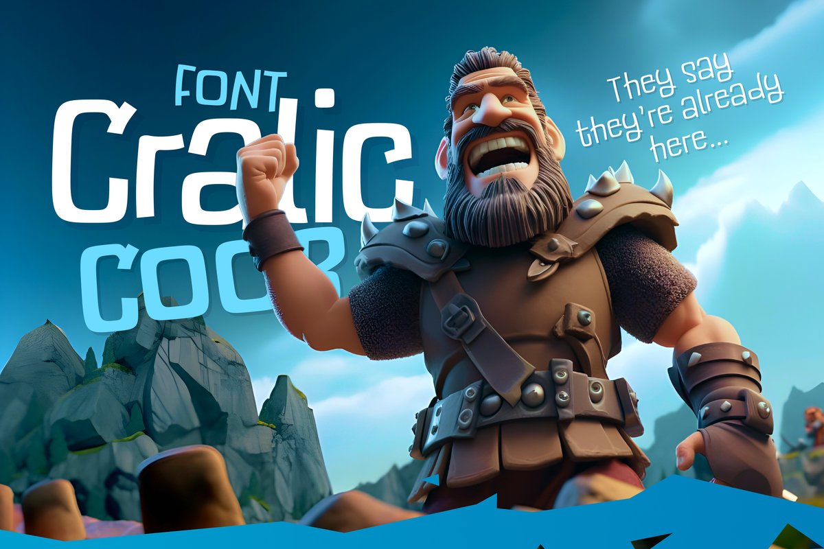
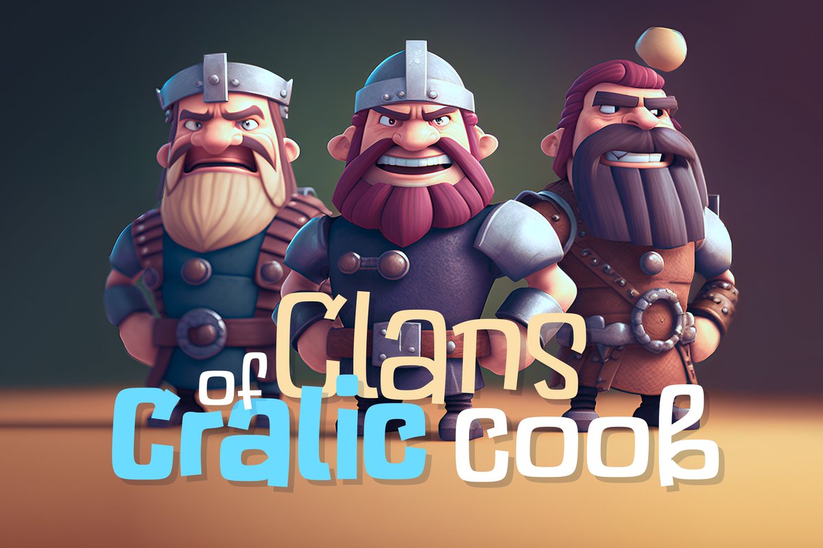
Cralic Coob is a narrow comic font for game titles, cartoon posters and kids' events. Casual, tall letters that take little width.

Free sample Thin · ZIP

Free download (ZIP)

Free for one person: personal and commercial use, client work included. A studio or team using it in its own work buys the full family. No resale or redistribution of the file. Read the license.

Full family 10 styles, sold as one family

  • Cralic Coob · OTF · Thin to Heavy
  • Alternate letters
Buy on Creative Market

Price and license are on the marketplace.

Cralic coob Regular in a layout

Max turns six

Saturday at noon, in the garden behind the toy shop.

Bring a hat and a big appetite. There will be a treasure hunt, a bouncy castle, pink lemonade and a cake shaped like a rocket. Parents are welcome to stay for coffee.

RSVP by Thursday to 555-0137. No gifts needed. Rain plan: the party moves inside the shop.

Try your own text

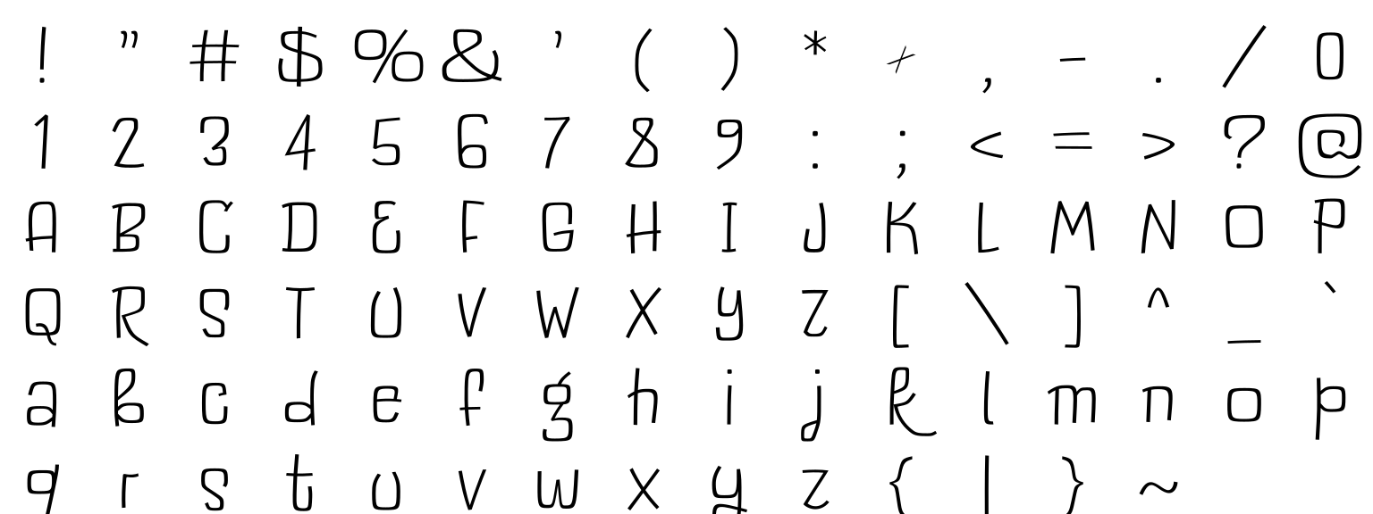
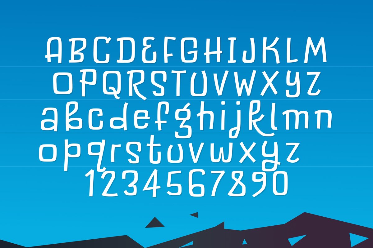
Cralic coob Regular, Latin letters, figures and punctuation

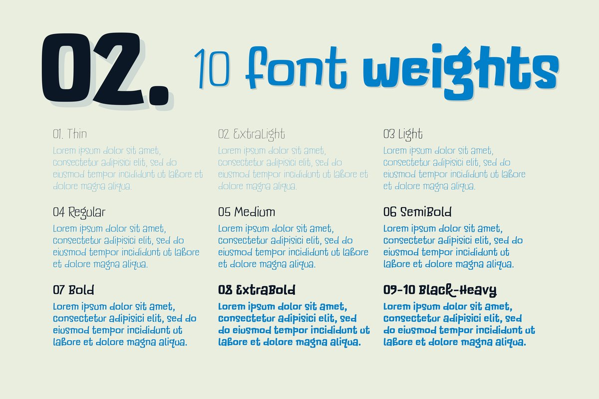
10 styles in the family

Cralic coob 10 styles

  • Cralic coob ExtraLight
  • Cralic coob Light
  • Cralic coob Regular
  • Cralic coob Medium
  • Cralic coob SemiBold
  • Cralic coob Bold
  • Cralic coob ExtraBold
  • Cralic coob Black
  • Cralic coob Heavy
  • Cralic coob Thinfree sample
Get the full family on Creative Market

The family is sold as a whole, not style by style.

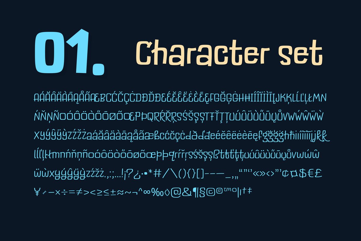
Characters

Latin letters, figures and punctuation of Cralic Coob

About Cralic coob

Tip Narrow letters fit a long title on one line of a phone screen or a box side without shrinking it.

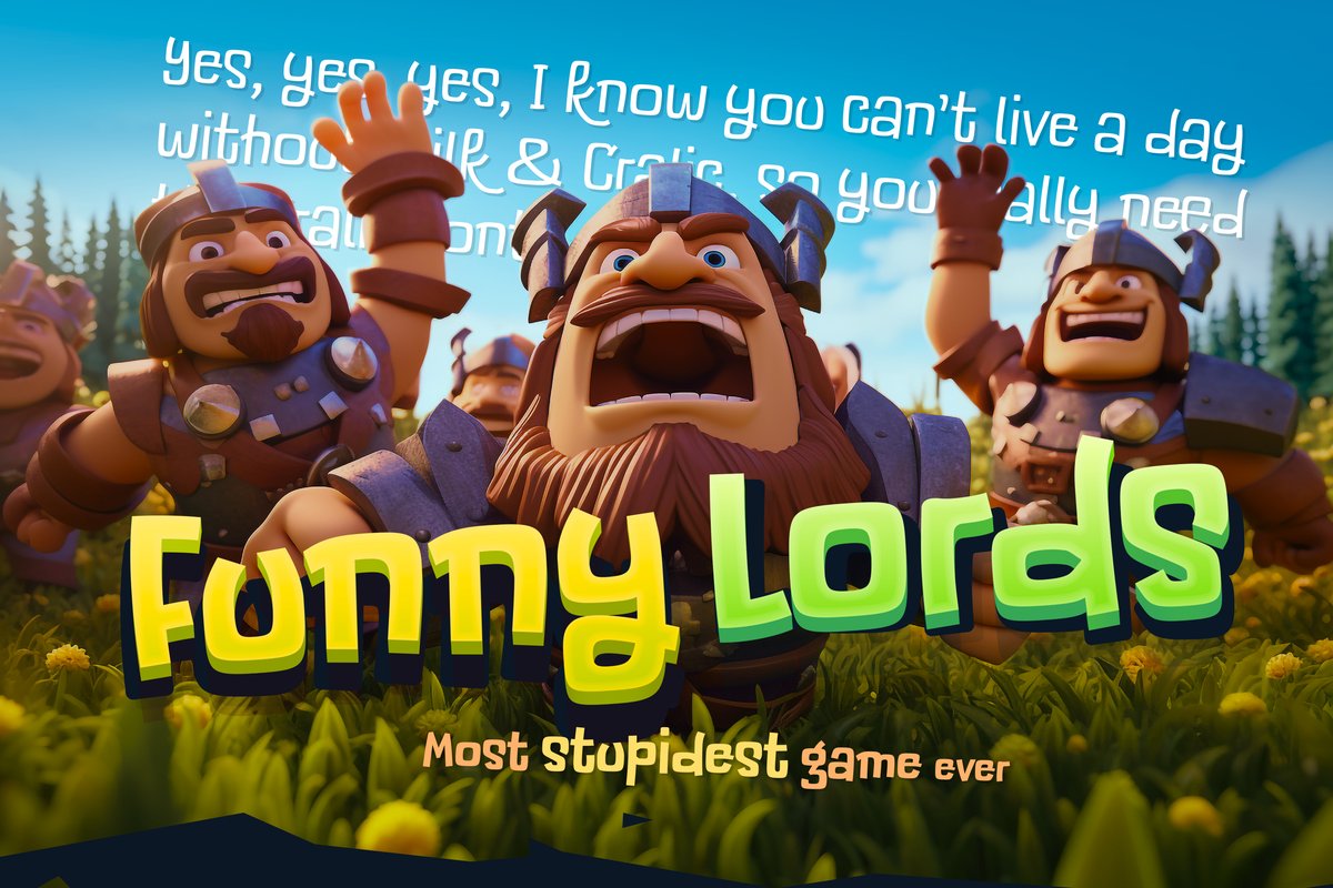
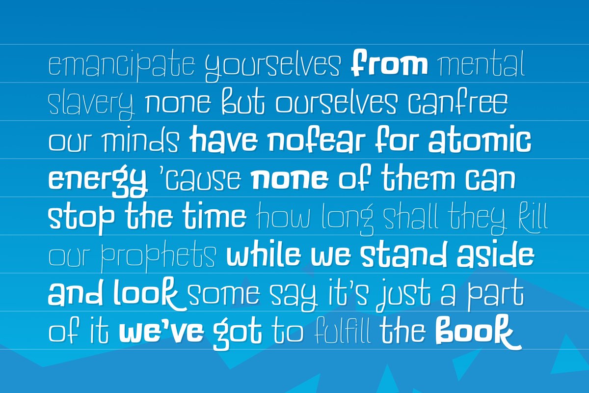
The Cralic Coob font is the tall, narrow companion to Cralic, with the same comic humor in less space. Use it for a mobile-game title, a comic poster, a kids’ event headline or a tight label on a box. Thin weights look like a pen sketch; heavy ones read from across a room.

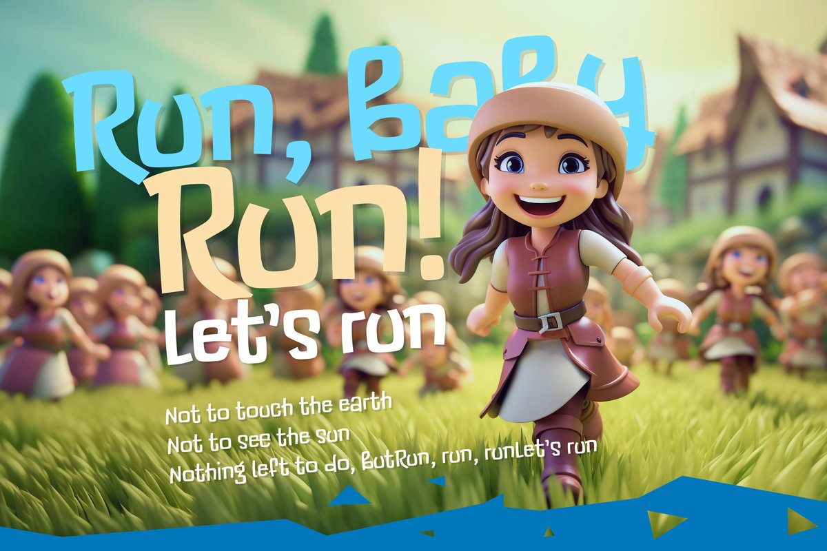
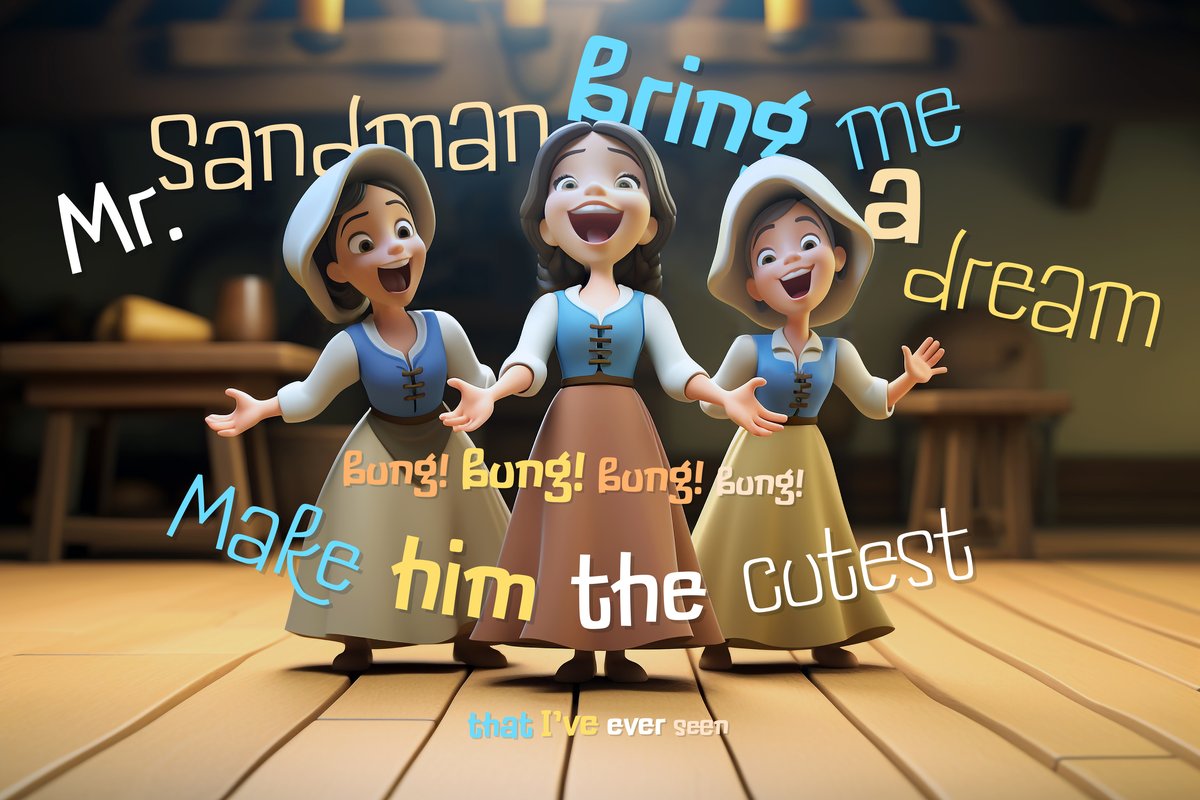
Cralic Coob keeps Cralic’s comic hand in a narrow cut. It has ten weights, Thin to Heavy (Thin, ExtraLight, Light, Regular, Medium, SemiBold, Bold, ExtraBold, Black, Heavy), and alternate letters. One specimen sets a song lyric along a curve, so the letters can follow a path.

Use the weights as a ladder: Heavy for the title, Bold for a subtitle, Regular for a short description, Light for credits. Alternates keep repeated letters from looking identical.

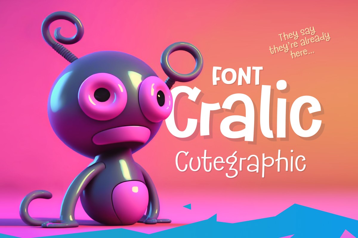
Cralic is a separate product. If you own both, set the headline in Cralic and the tagline in Cralic Coob: the two share the same hand, so the layout holds together while the width changes.

Similar fonts

Picked by tags: hand drawn, kids, packaging, cartoon, headline.