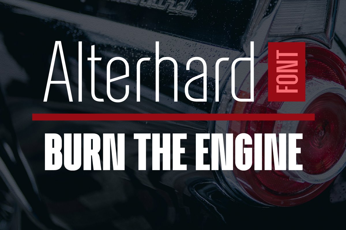
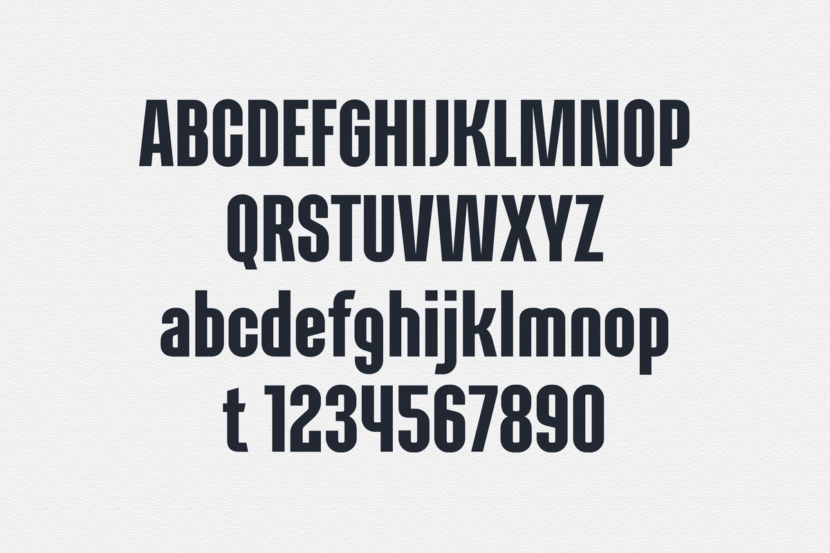
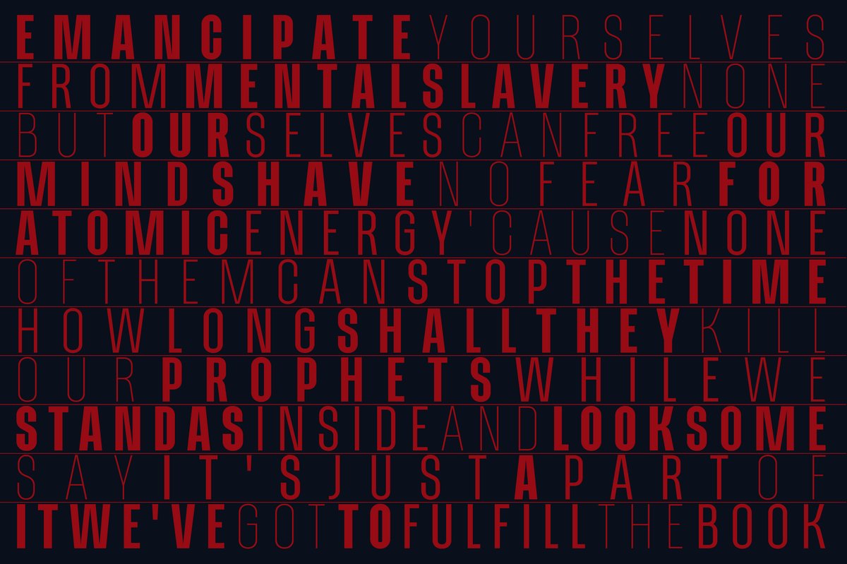
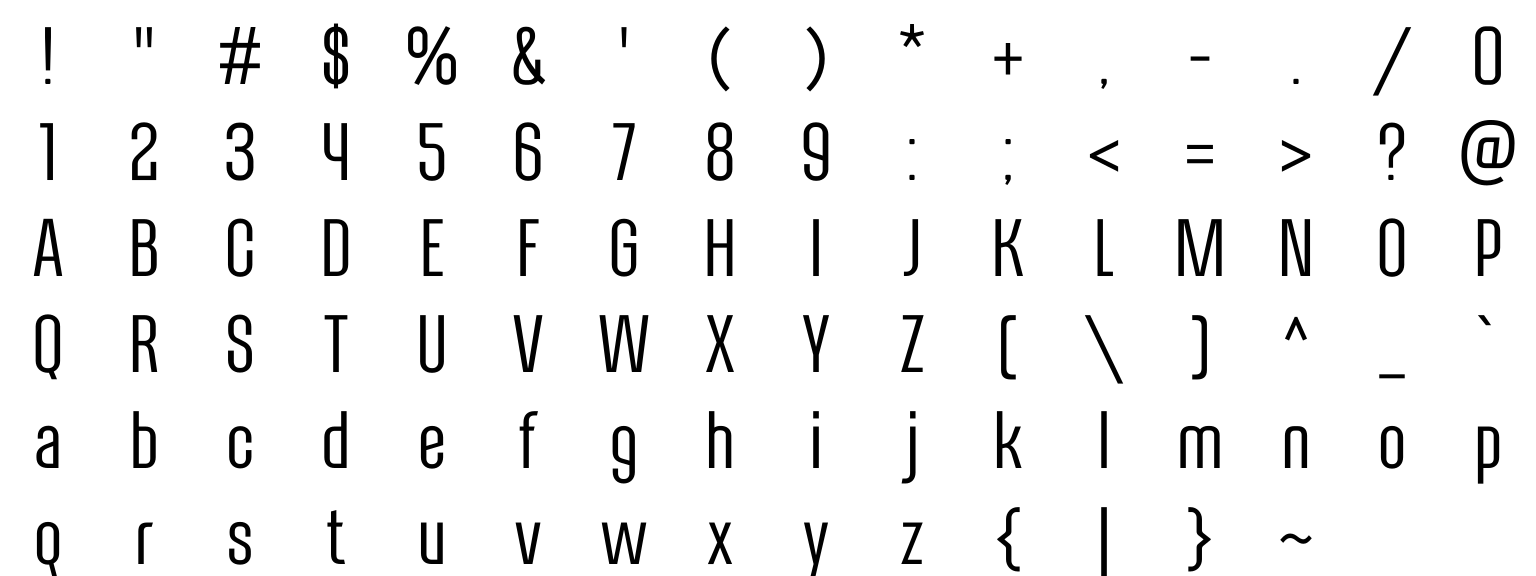
The Alterhard font has the formal, narrow build of early twentieth-century poster lettering, redrawn for modern layouts. Use it for a movie or concert poster, a boxing-night flyer, a magazine headline or a motorsport brand. Mix thin and heavy weights in one block of capitals for a dense poster look.
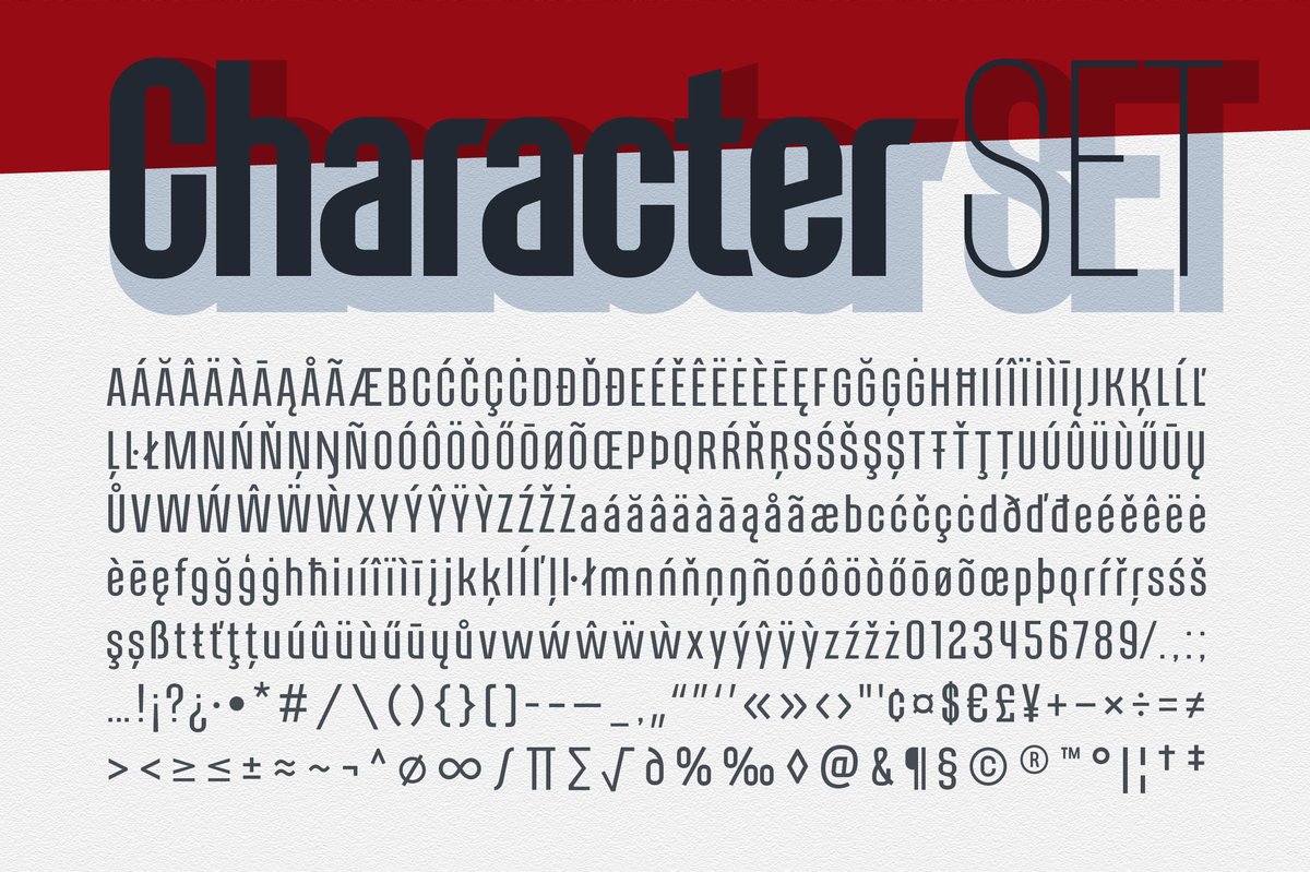
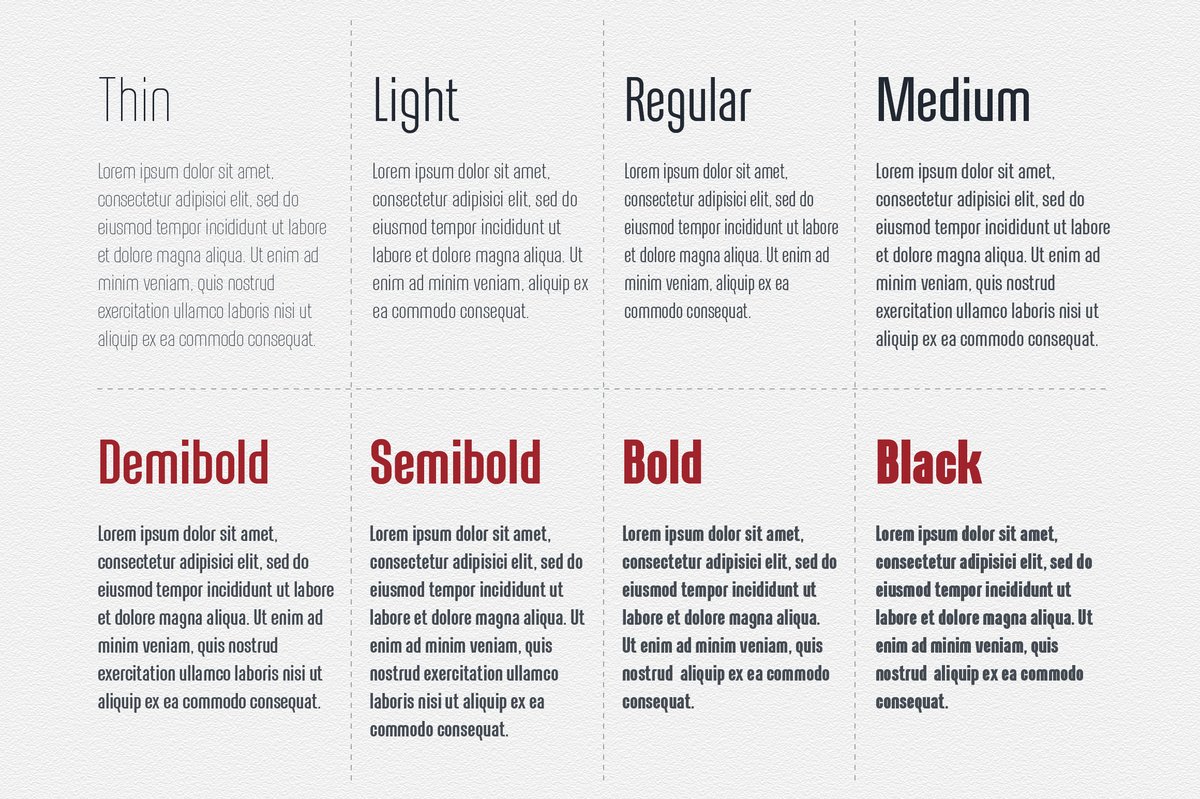
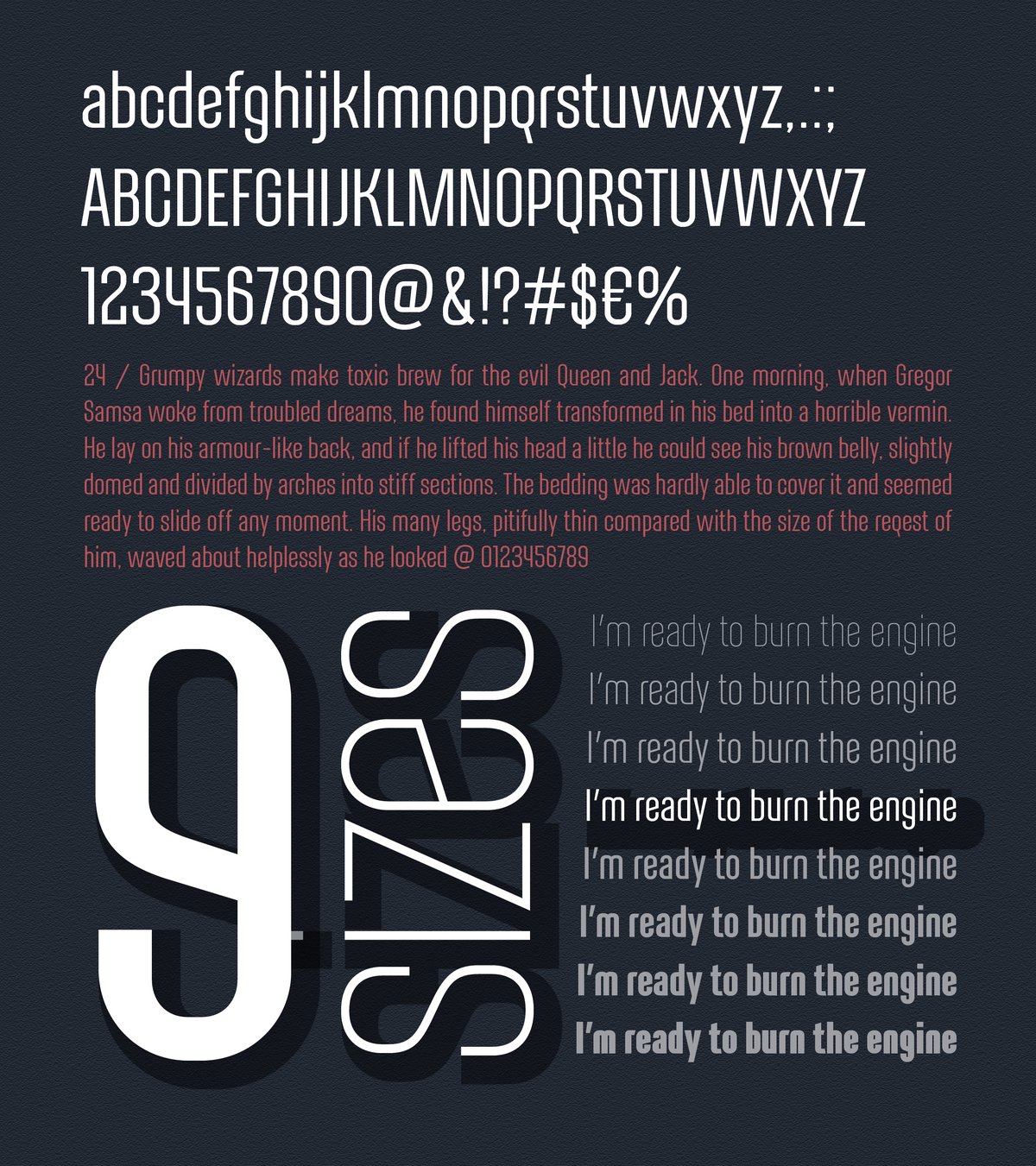
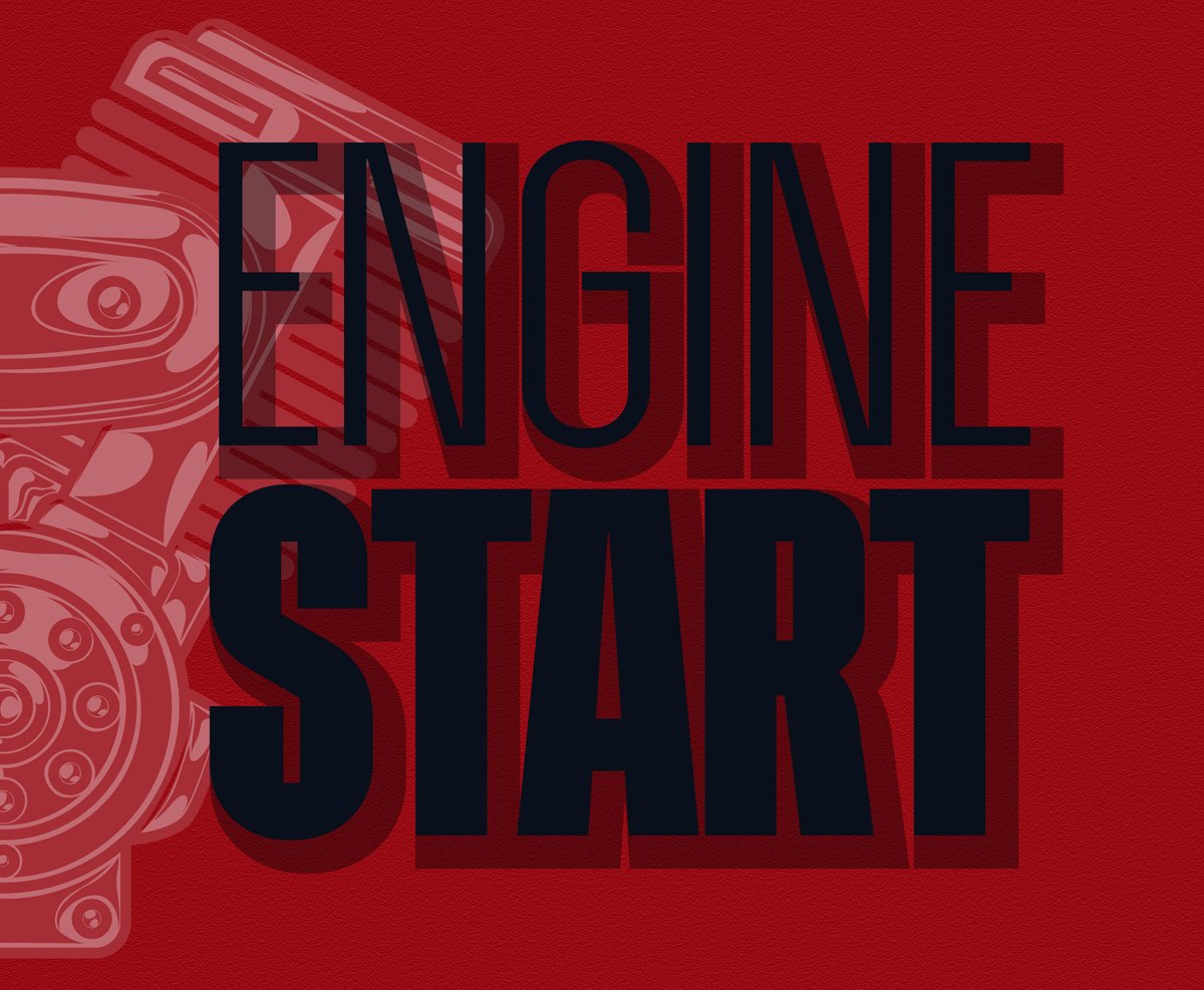
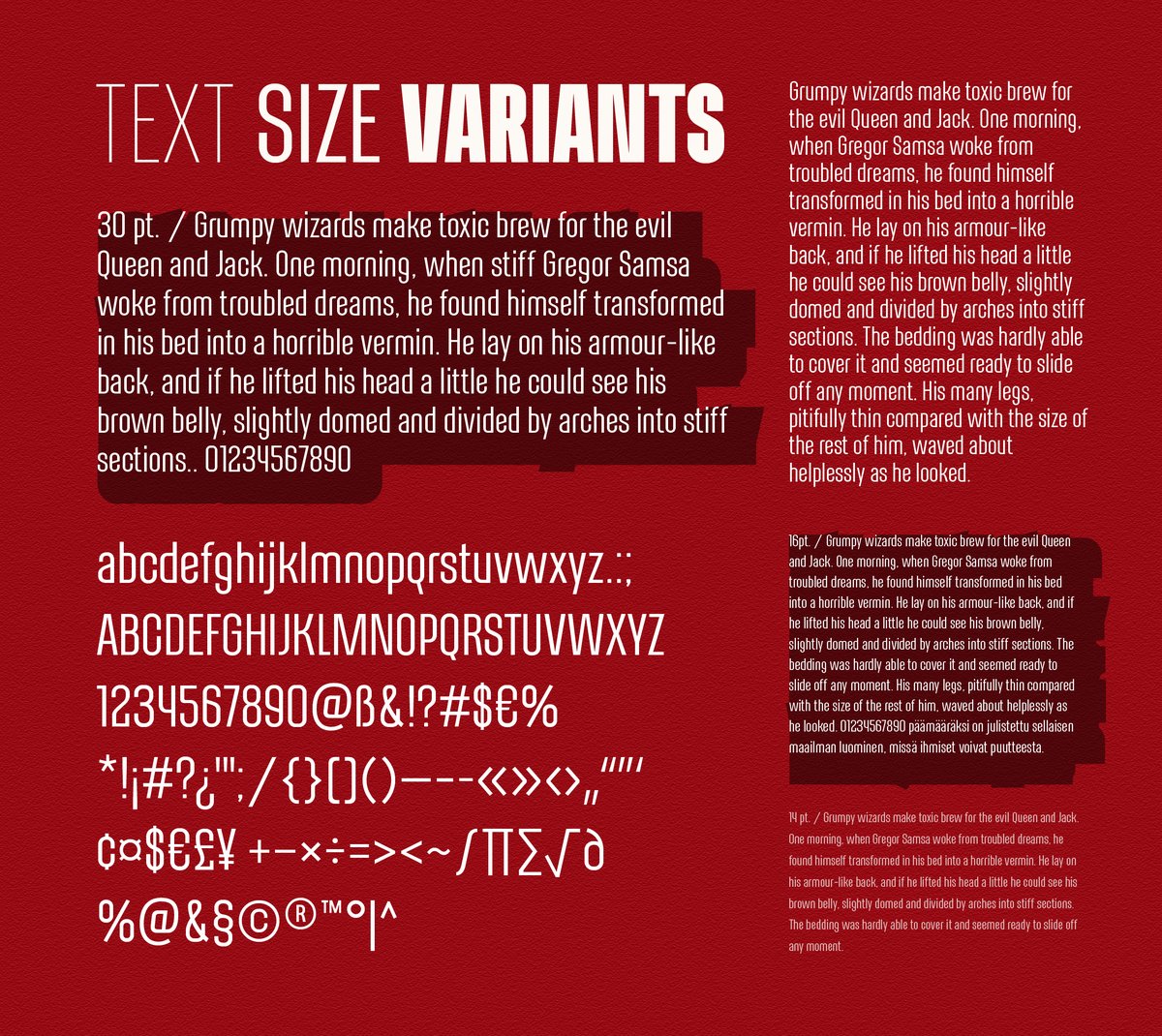
The nine weights run Thin, ExtraLight, Light, Regular, Medium, DemiBold, SemiBold, Bold and Black. In the specimens, “Engine start” sets the thin weight above the black one, and a red wall of capitals alternates thin and heavy lines.
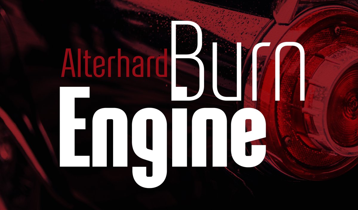
Two moods show the range. The dramatic one is big capitals over a close-up photo of a tail light or an engine, with a thin line for the studio name. The quiet one is a bold headline over a short paragraph. The mood changes with the weight, not with the typeface.
For film and event work, set the title in Black capitals, the date in Medium and the credits in Light. For a magazine, use Bold for the headline and Regular for the intro. A sheet in the specimens sets paragraphs in several sizes in red on dark, a quick way to see how small the type can go before the narrow letters get tight.
For the small print under a narrow headline, set the text in Altertypo, which is calm enough to sit next to Alterhard’s tall capitals.