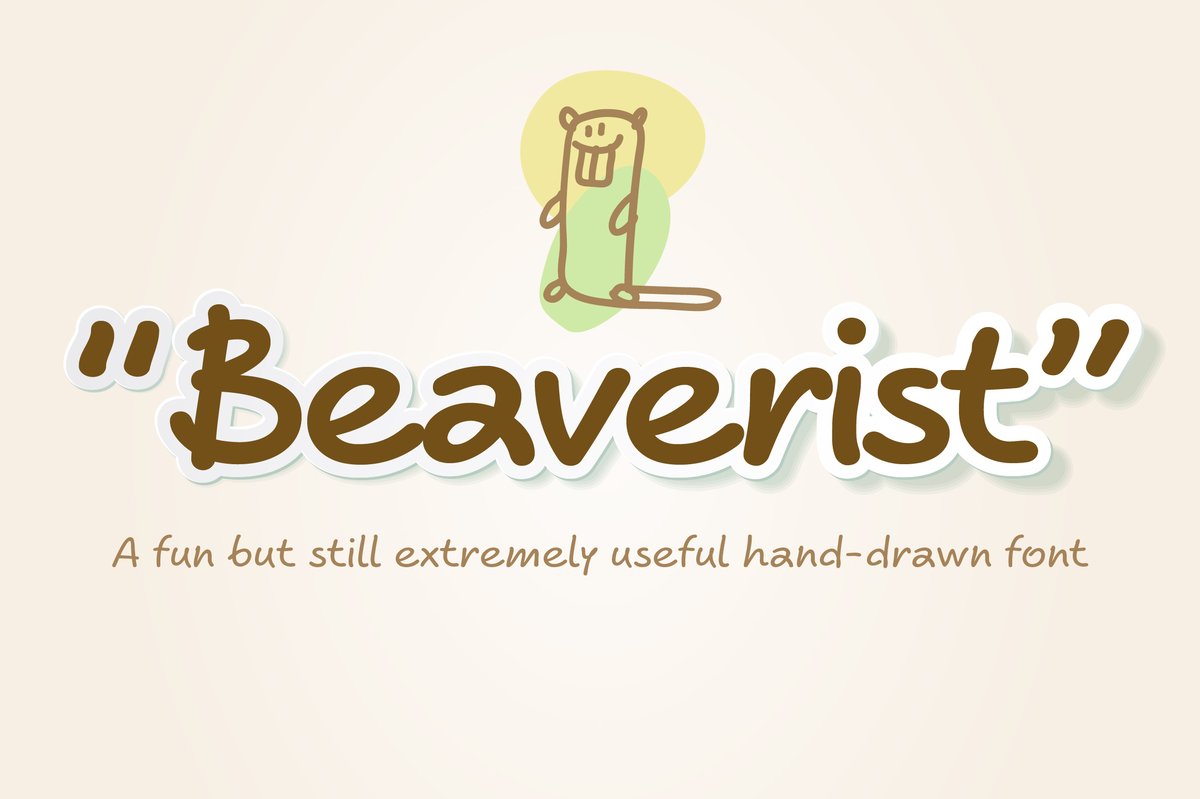
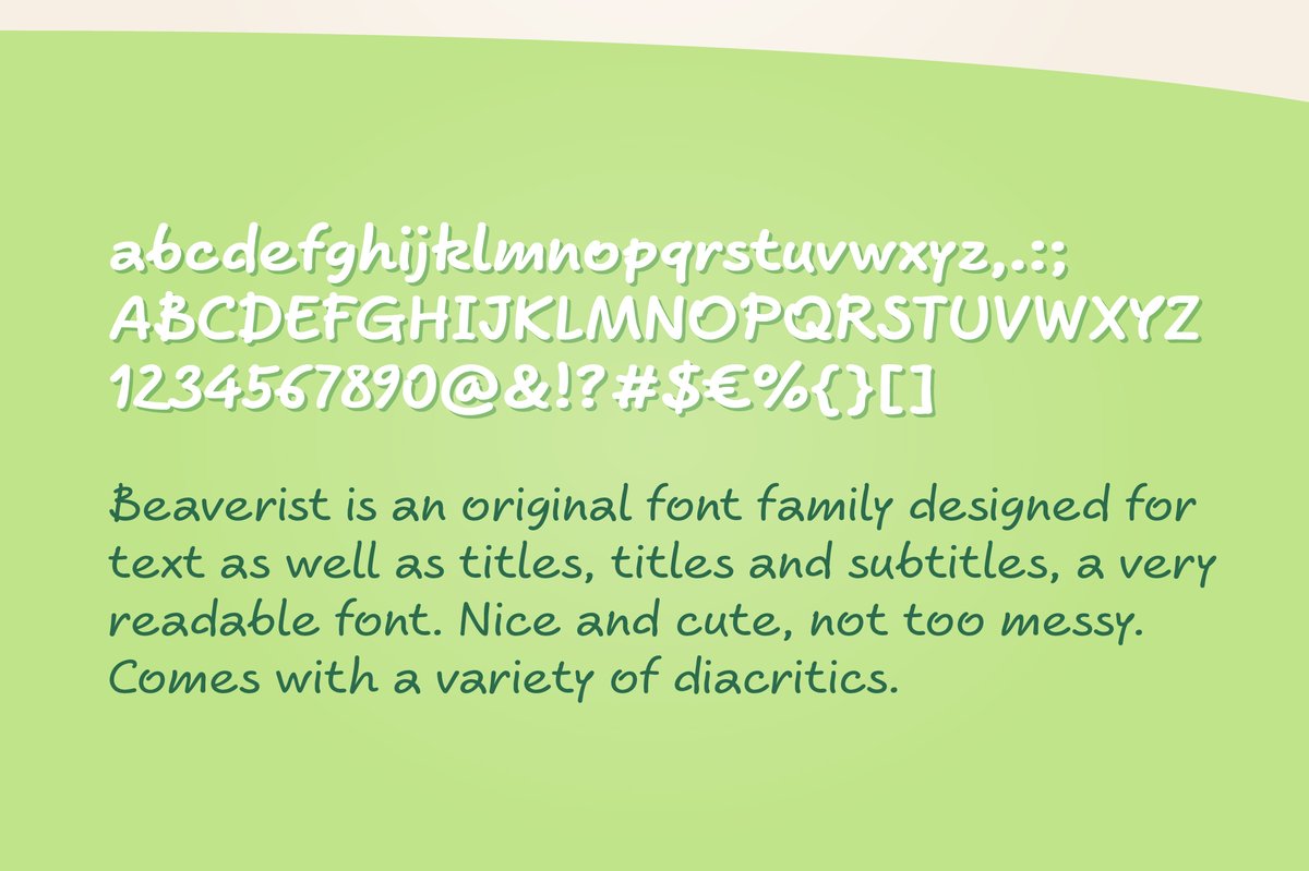
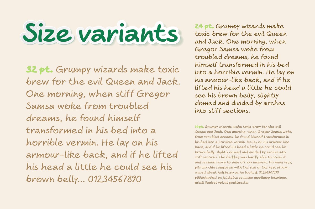
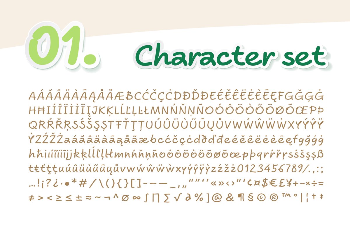
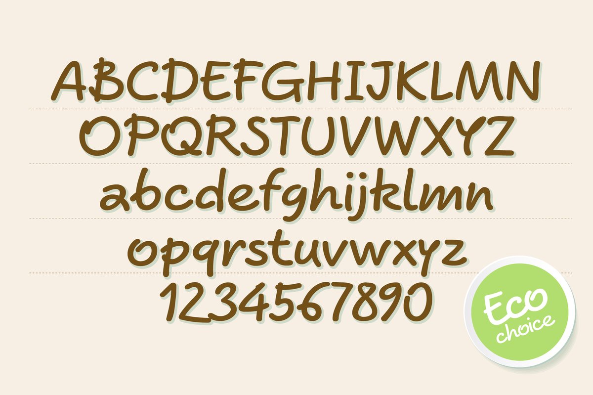
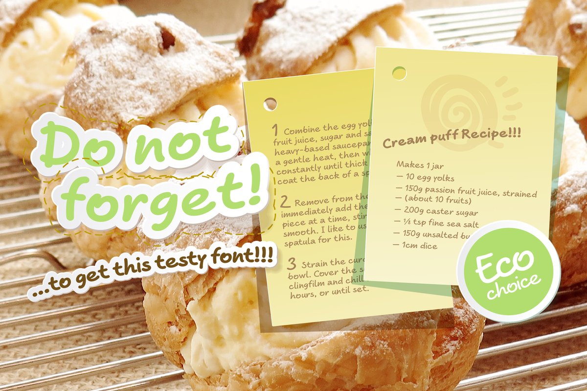
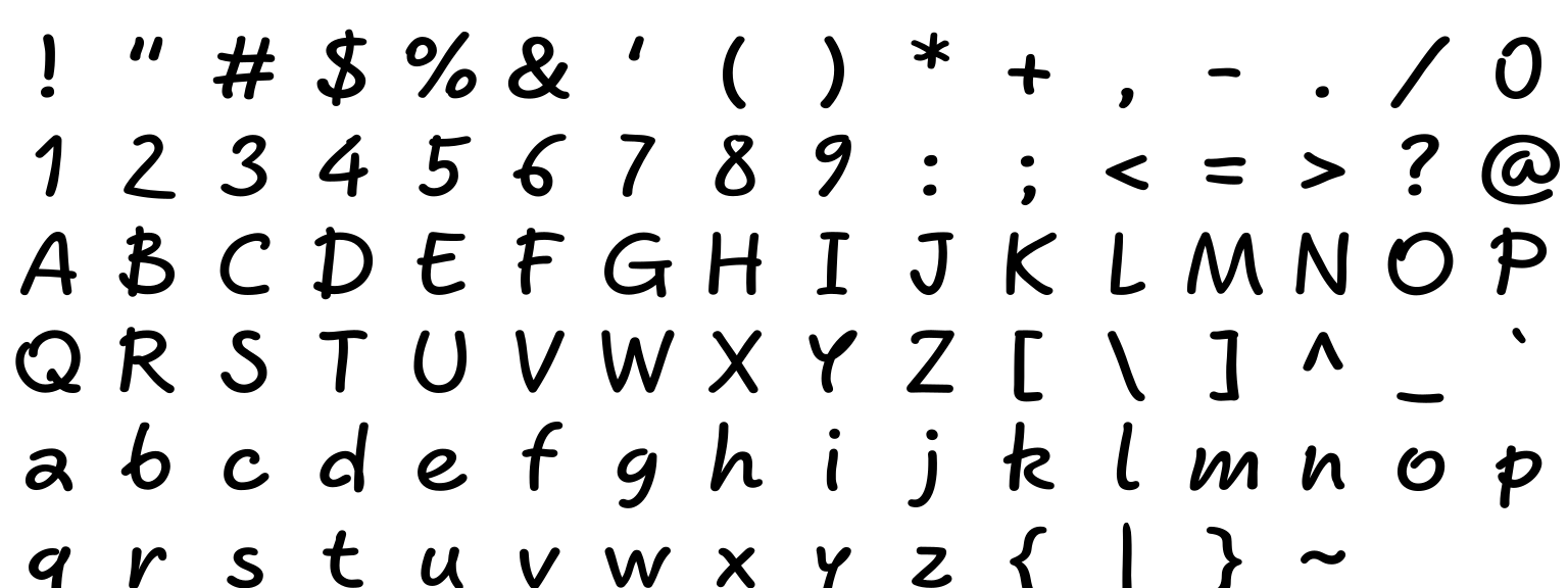
The Beaverist font has the easy rhythm of a hand that writes every day. Use it for a natural-cosmetics label, a bakery menu, a recipe card or a caption on a social post. Light weights look like a pen; heavy ones like a marker.
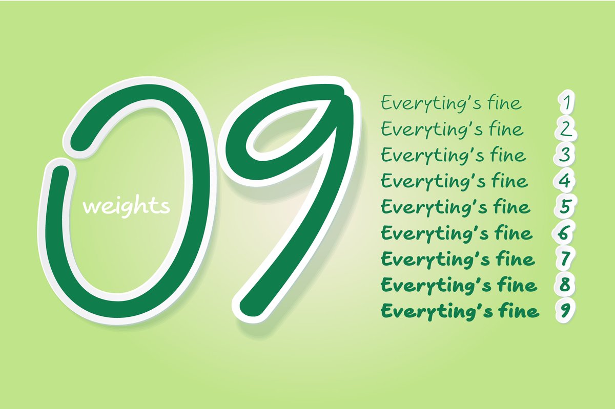
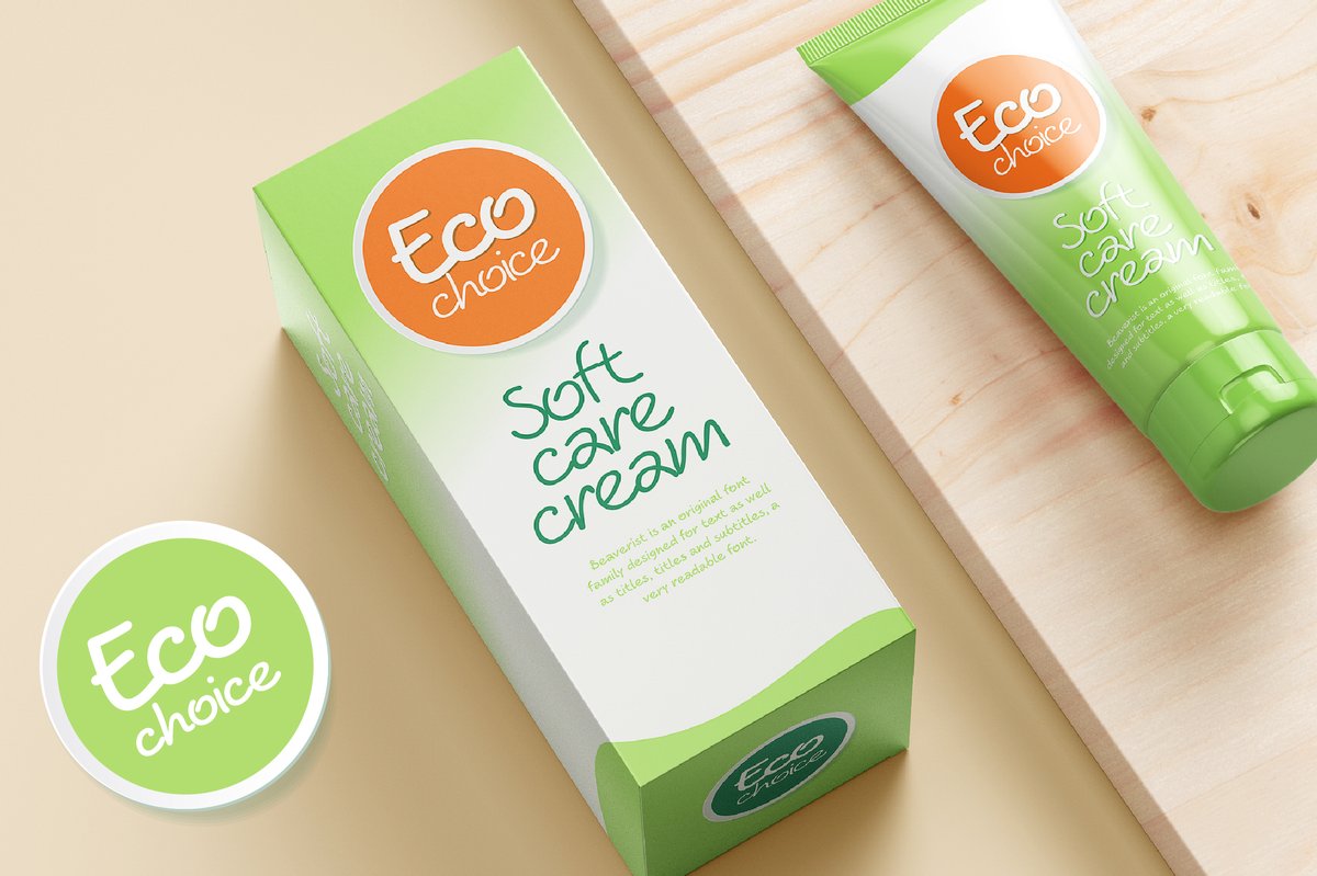
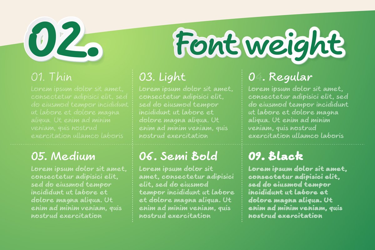
Beaverist is built for small, friendly texts that should sound like a person. The nine weights run Thin, ExtraLight, Light, Regular, Medium, SemiBold, Bold, ExtraBold and Black. The specimens use brown and green on cream: a box and a tube of “Soft care cream” with round “Eco choice” labels, and yellow recipe cards beside a photo of cream puffs.
Repeated letters are where a handwriting font usually gives itself away, because the same shape appears twice. With the alternates a menu board or a package label can look written rather than typed. The full version adds effect styles for Illustrator.
For a recipe card, use Regular for the ingredients and Bold for the title. For a cosmetics or food label, put the product name in Black and a short line in Light. On a social post, one handwritten line over a photo is enough. Short lines keep the handmade feel; a whole paragraph of handwriting tires the eye.
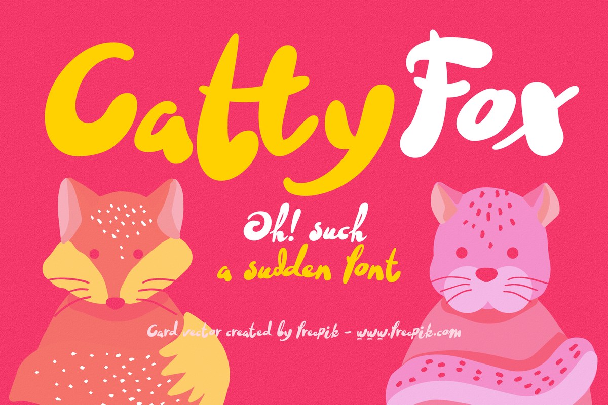
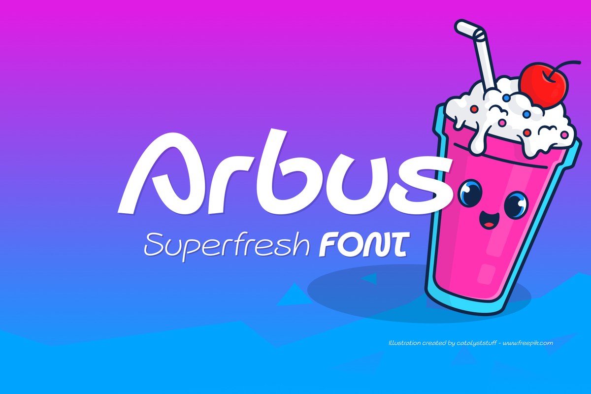
Arbus is the plainer, even-line choice when handwriting should stay quiet, and Cattyfox is the loud brush option for one big word.